Engagement
Comments, reactions and shares over time, your top-performing posts, every post plotted by reach against engagement rate, and clicks on the links you shared.
Overview
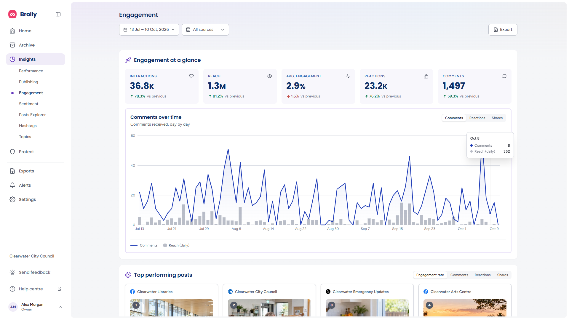
Engagement measures response: how many people your posts reached and what they did about it. It shows comments, reactions and shares day by day, ranks your best posts, plots every post so the outliers stand out, and counts clicks on the links you shared and which posts drove them.
How to Get There
- Click Insights in the left sidebar, then Engagement
Set the period and accounts with the date range and sources controls at the top, and use Export for the printable report. They are described in The Toolbar.
Engagement at a Glance
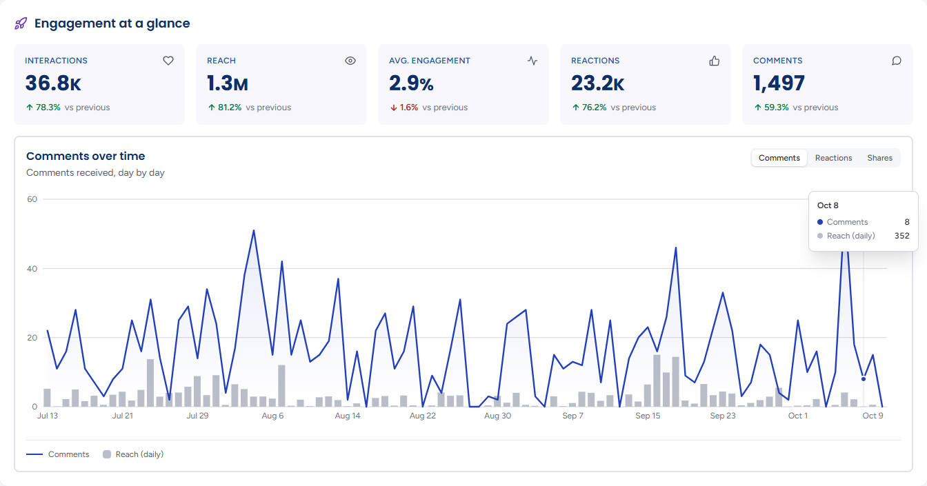
- Interactions — reactions, comments and shares combined
- Reach — how many people your posts reached
- Avg. engagement — interactions as a share of reach
- Reactions and Comments — stated as counts
Each carries an up or down badge against the previous period. The comment count comes from the comments in your Archive rather than the platform's own tally, which can arrive weeks later, and it is the same count the other Insights pages use.
Comments over Time
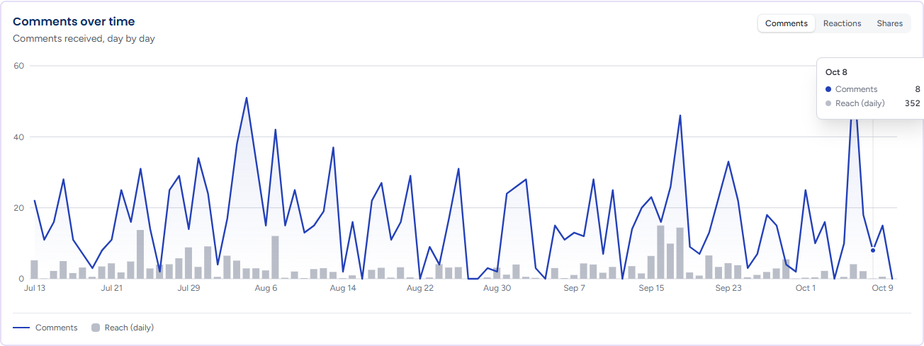
Comments received, day by day. The line is the chosen interaction per day and the grey bars are Reach (daily), so a busy day of comments can be read against how many people saw the posts. The toggle at the top right changes what the line shows — Comments, Reactions or Shares — and the block's title and subtitle follow it:

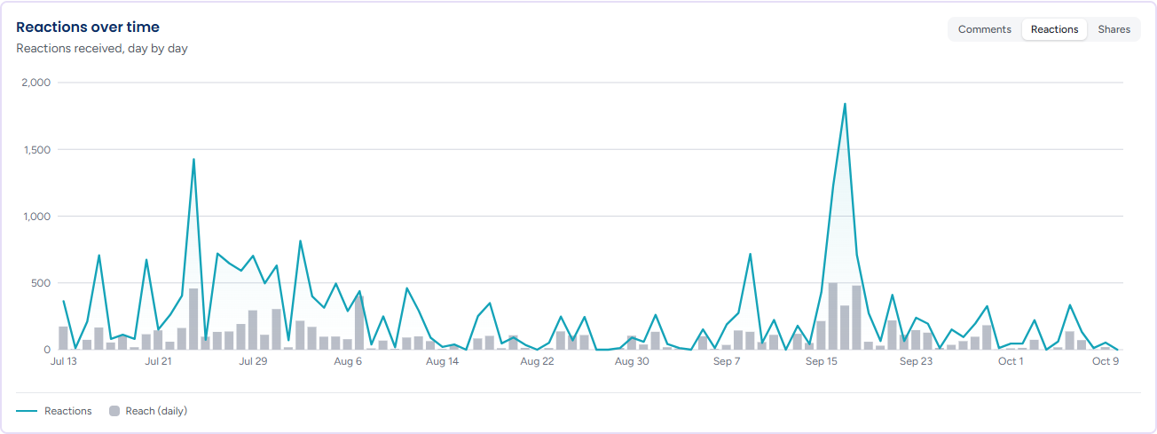
Hover a day for the day's count and reach. A series with nothing in it reads, for example, No shares recorded in this period.
Top Performing Posts
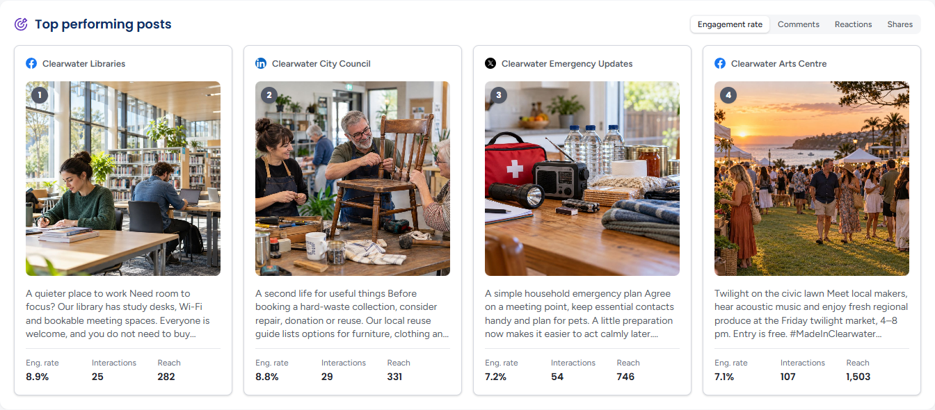
Your four best posts for the period, numbered 1 to 4 and shown with their account, picture and text. Click a card (or press Enter on it) to open it in the Post Inspector.

The toggle at the top right sets what "best" means, and the three figures on each card change with it:
- Engagement rate (the default) — cards show Eng. rate, Interactions and Reach
- Comments, Reactions or Shares — cards show that count, then Interactions and Eng. rate
A note beneath may say Ranked within the N posts with the most interactions in this period — the ranking is then of that pool rather than of every post. On a narrow window the cards go one, two or four across to fit. With nothing to rank the panel reads No posts with metrics in the selected range.
Post Performance
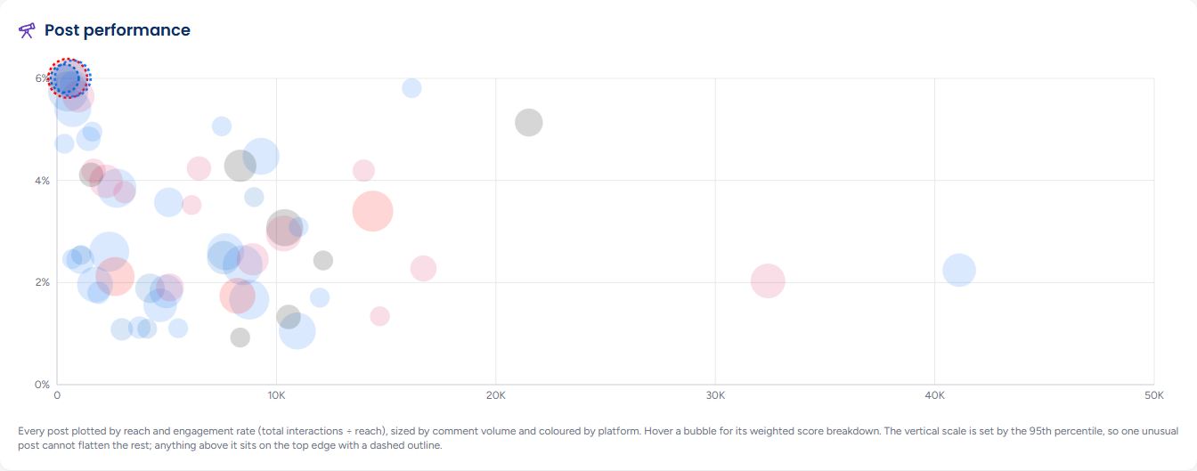
Every post in the period as a bubble. Reach runs left to right and engagement rate (interactions ÷ reach) bottom to top, so the posts that both travelled far and drew a response sit in the top right. Bubble size is the post's comment count and colour is its platform. Hover a bubble for its weighted score breakdown and click it to open the post in the Post Inspector; from the keyboard, the arrow keys move between bubbles left to right by reach and Enter opens one.
The vertical scale is set by the 95th percentile so that one unusual post cannot flatten the rest; anything above it sits on the top edge with a dashed outline. A line beneath the chart states the range of both axes and names the account behind the highest engagement rate. Posts seen by too few people to carry a rate are left out and counted in the note (N posts are not shown: under 20 reach, interactions ÷ reach is too volatile to be a rate); a period with no reach data at all reads No post in this period has reach data to plot yet.
Outbound Links
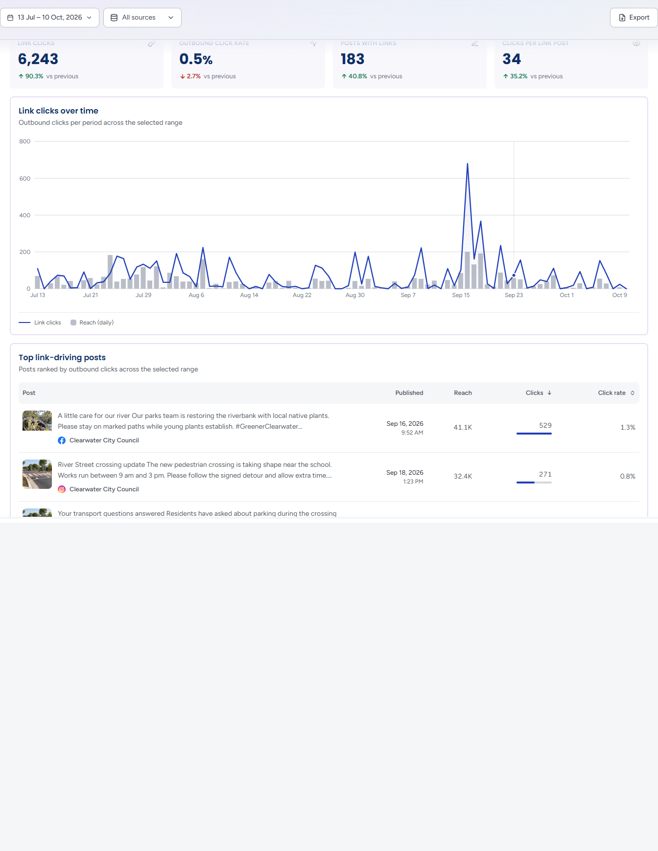
Shown only when at least one post in the period carried a link. Four figures with their badges against the previous period: total Link clicks, the Outbound click rate, the number of Posts with links and the average Clicks per link post.
Link clicks over time
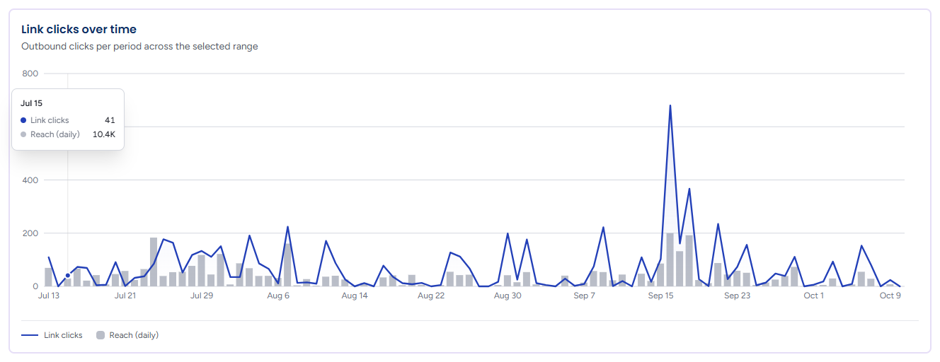
Outbound clicks per period across the selected range: a line of link clicks per day over grey bars of Reach (daily), so a day of heavy clicking can be read against how many people saw the posts. It is drawn only when some clicks were recorded in the period.
Top link-driving posts
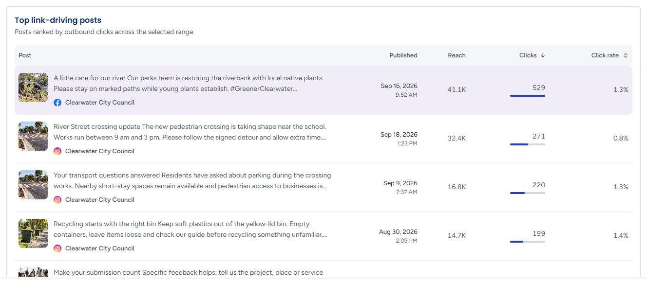
Posts ranked by outbound clicks across the selected range, in a table with the post's text and account, when it was Published, its Reach, its Clicks — drawn as a bar relative to the top post — and its Click rate. Clicks is the default sort; click Click rate to rank by that instead, and click the same heading again to reverse the order.
Click rate is clicks ÷ reach, measured per post. No per-link figure is implied, so a post sharing more than one link is counted in full. Select a row to open the post in the Post Inspector and see its destination.
Tips
Rank Top performing posts by Comments when you want to know what started a conversation, and by Shares when you want to know what travelled — the two lists are often different.
A bubble low and far right on Post performance is a post many people saw but few responded to. Open it in the inspector and compare its engagement rate with the account average.
A post high on Top link-driving posts but with a low Click rate was simply seen by a lot of people. Posts with a high rate on a small reach are the ones whose wording made people click — worth repeating.