Performance
The headline figures for the period — posts, reach, interactions, engagement and sentiment — with the best days and times to post and how each post type performs.
Overview
Performance is the first page of Insights and the one to read for a quick answer to "how did we do?". Its heading reads Insights Performance Overview. It puts five headline figures at the top, shows how interactions moved day by day, maps activity across the days of the week and hours of the day, and breaks results down by post type.
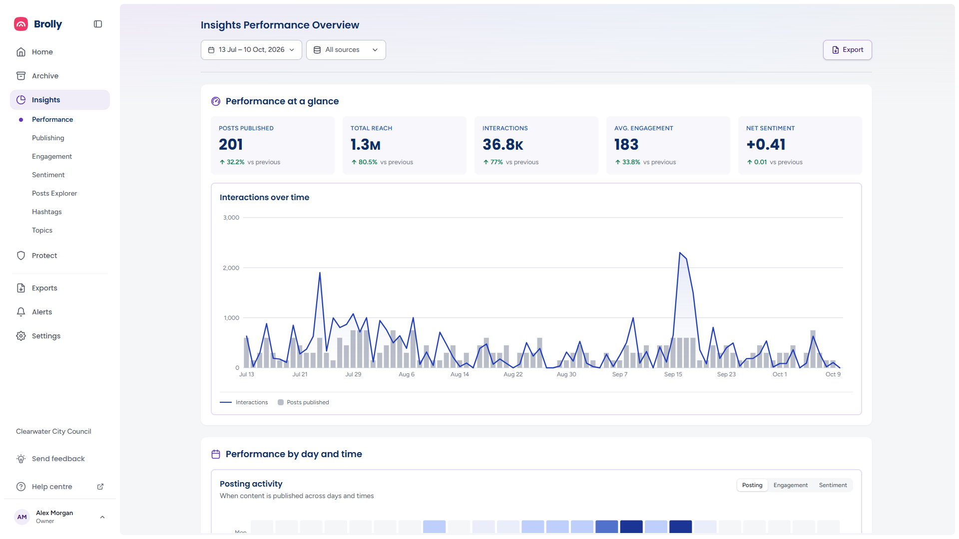
How to Get There
- Click Insights in the left sidebar — it opens on Performance
- Or click Performance beneath Insights from any other Insights page
Set the period and accounts with the date range and sources controls at the top, and use Export for the printable report. They are described in The Toolbar.
Performance at a Glance
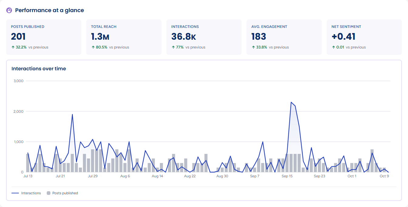
Five figures for the period and accounts you have chosen, each with an up or down badge against the previous period of the same length:
- Posts published — how many posts your accounts put out
- Total reach — how many people those posts reached, added across posts
- Interactions — reactions, comments and shares combined
- Avg. engagement — interactions per post
- Net sentiment — the balance of positive and negative response, from −1 to +1
Green badges mean the figure moved the right way and red the wrong way. For net sentiment the badge shows the change in the score rather than a percentage. When reach has not been collected yet for the period, the Posts published and Net sentiment comparisons still show; the others wait. If the summary cannot be loaded the panel says Unable to load your performance summary with a Retry button.
Interactions over Time
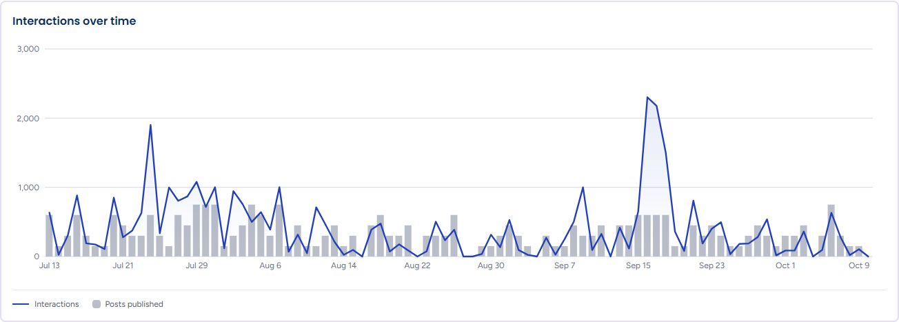
The line is interactions per day and the grey bars behind it are the posts published each day, so you can see whether a spike in interactions came from posting more or from a post that travelled further.
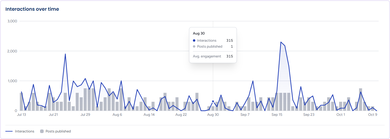
Hover any day for its Interactions, Posts published and Avg. engagement (that day's interactions per measured post). A period with nothing published reads No posts were published in this period. Like every Insights chart, it has a text alternative — a table of the same figures, one row per day — for screen readers.
Performance by Day and Time
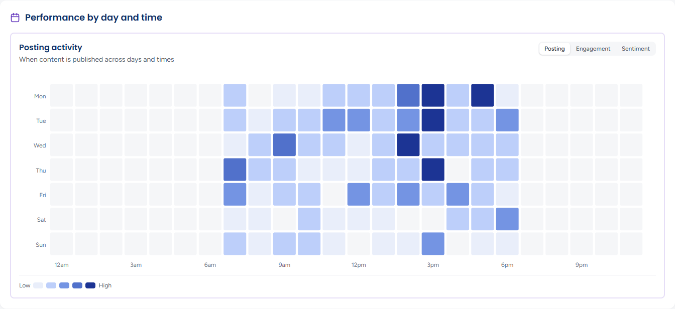
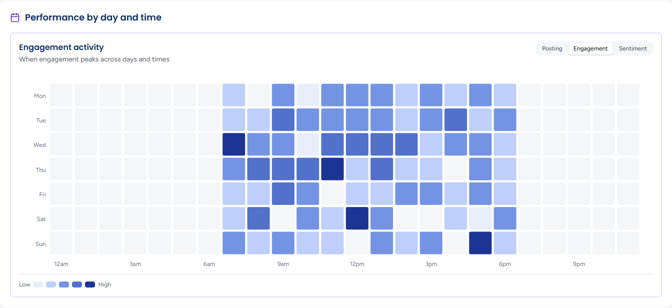
A grid of the seven days of the week against the 24 hours of the day, from 12am to 11pm, with a Low to High scale beneath. Darker cells mean more of whatever the grid is showing. The grid's title changes with the toggle at its top right:

- Posting — Posting activity: when content is published across days and times
- Engagement — when the interactions arrive
- Sentiment — how positive or negative the response is by day and hour: green cells are positive and red cells negative, striped so the two directions can be told apart without colour, and the stronger the colour the stronger the sentiment
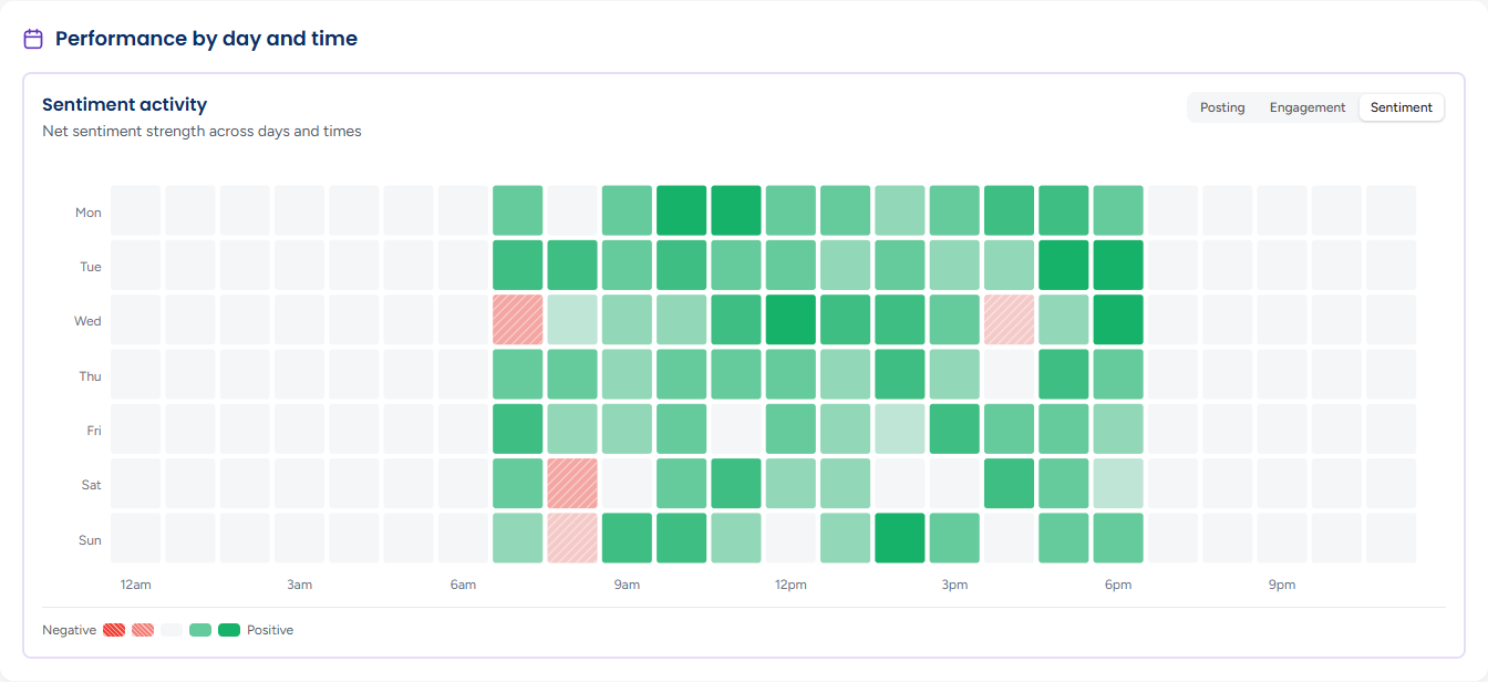
Hover a cell to read its figures — the Posts published in that slot, its Engagement rate and its Net sentiment, whichever view you are on. Reading Posting against Engagement is the quickest way to find slots where you post little but the audience is active. The grid reads in your organisation's timezone. On a narrow window it folds its hours into two- or three-hour blocks rather than scrolling sideways. With nothing published in the period the grid draws empty and says No posts were published in this period.
Performance by Post Type
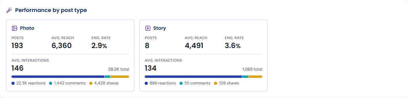
One card per format you have used in the period, from the vocabulary Photo, Video, Story, Text and Other, each with its format icon. Each card gives the number of posts of that type, their avg. reach, eng. rate and avg. interactions, then the type's total interactions as a bar split into reactions, comments and shares, each with its count. A period with no scored posts reads No per-post-type performance data in the selected range.
Tips
Compare Eng. rate across post types rather than Posts: the format you use most is not always the one that works best.
The day-and-time grid reflects the period you chose. Widen it to Last 90 days or longer before drawing conclusions about the best time to post — a fortnight is too few posts to show a pattern.
A rise in Total reach with flat Interactions usually means a post travelled through shares rather than sparking conversation. Check Engagement to see which.