Insights
What the Insights module shows, how its seven pages fit together, and the date range, sources and Export controls they all share.
Overview
Insights turns the content Brolly has captured from your accounts into a picture of how it is performing — how much you publish and when, how far it reaches, how people respond, how they feel about it, and which hashtags and subjects are driving that response. Every chart is built from the records in your Archive, so any figure can be traced back to the posts behind it: most cards open the Post Inspector for a single post, and the Posts Explorer lists every post with its numbers.
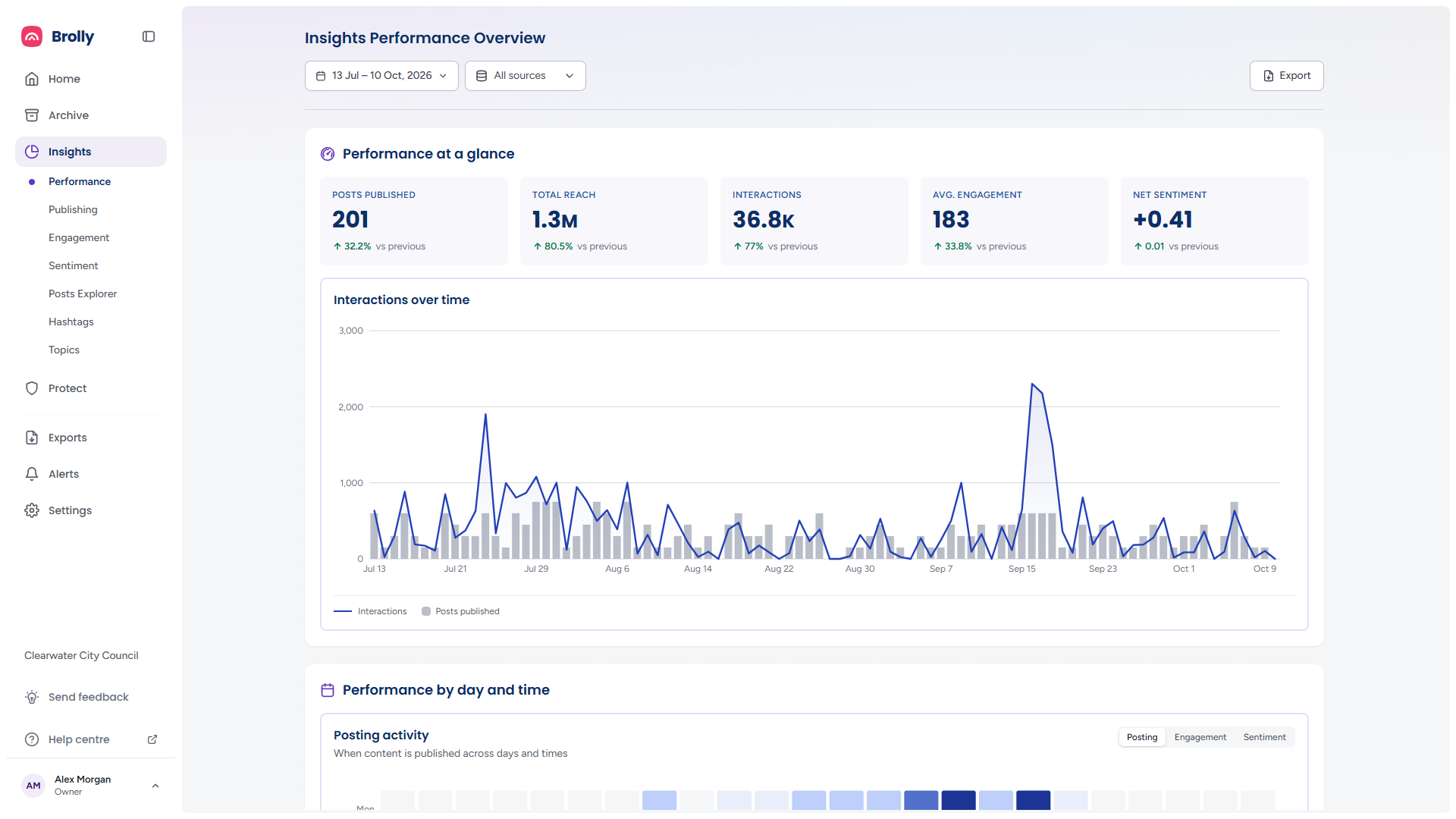
Insights is an optional module. Organisations with the Advanced insight add-on see the full module described in these guides. Without it, Insights in the sidebar shows an overview page — See the signals. Understand the story. — with a sample dashboard, four short descriptions of what the module does, and two buttons: Request free trial and Get a demo.
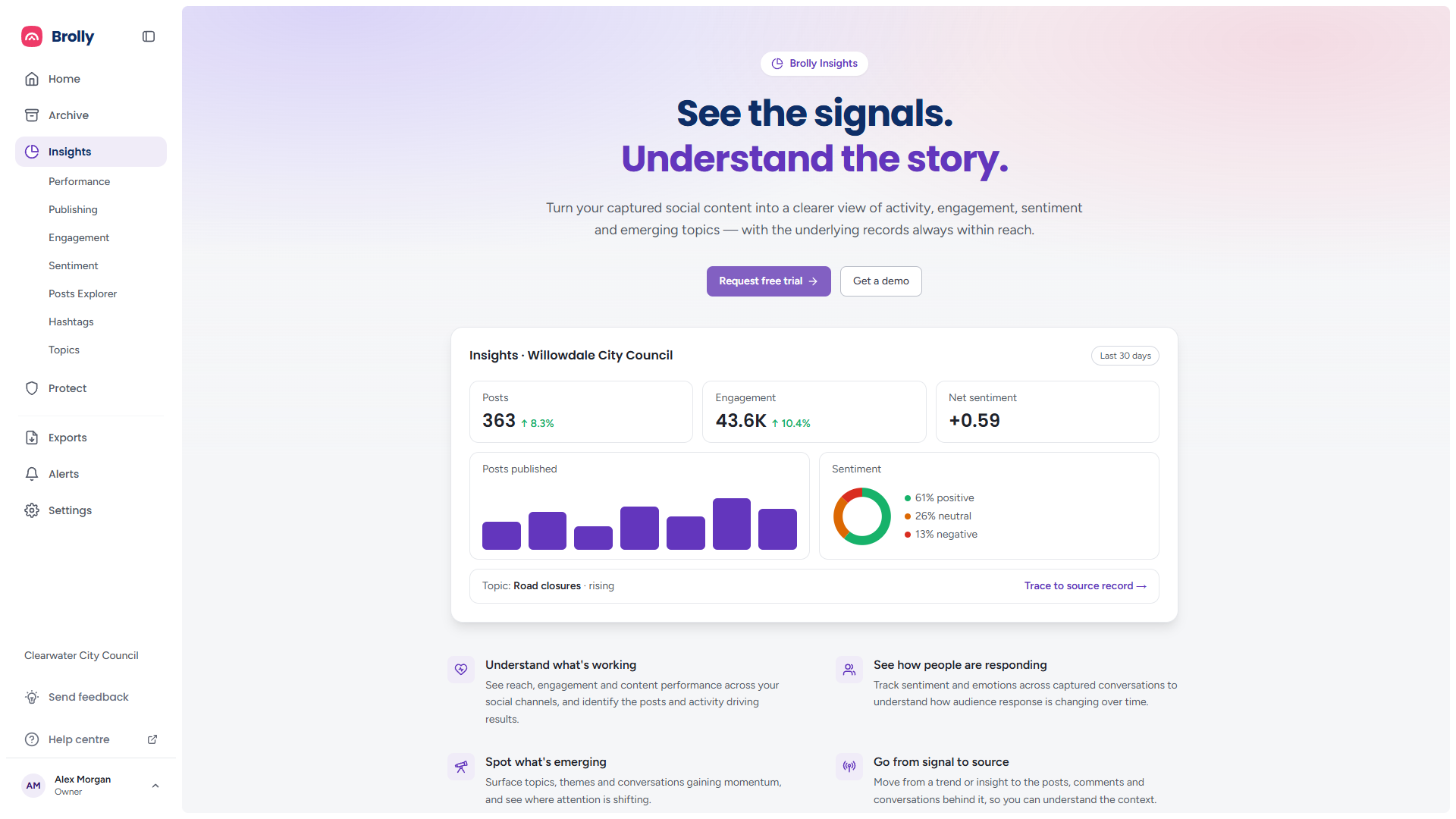
Request free trial sends a request to Brolly; the button reads Sending… while it goes, then disappears in favour of a thank-you line, because a second click would only send a second request. Get a demo opens a booking calendar and stays available throughout.
How to Get There
- Click Insights in the left sidebar. It opens on Performance and expands to show its seven pages
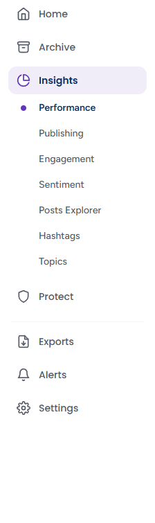
- Performance — the headline figures for the period: posts, reach, interactions, engagement and sentiment, plus the best days and times and the best-performing post types. See Performance
- Publishing — how much you publish, when, in what formats, on which platforms, and what your accounts and the public did in the Archive. See Publishing
- Engagement — comments, reactions and shares over time, your top posts, how every post compares, and clicks on the links you shared. See Engagement
- Sentiment — how positive or negative the response to your content is, and the emotions behind it. See Sentiment
- Posts Explorer — every post in the period as a sortable table, each opening the Post Inspector. See Posts Explorer
- Hashtags — which hashtags earn reach, engagement and goodwill. See Hashtags
- Topics — the subjects your content covers and how each one is landing. See Topics
The Toolbar
Performance, Publishing, Engagement, Sentiment, Posts Explorer and Hashtags share the same date range and sources controls, and all but the Posts Explorer have an Export button at the right. Whatever you set here carries into every chart on the page. The toolbar is sticky: once you scroll past the page title it pins to the top of the page, so the controls stay within reach. Topics has a period picker of its own instead of the date range and sources, described in Topics.

Date range

The date button reads the period currently in effect, for example 13 Jul – 10 Oct, 2026. Click it to choose another. Pick a quick select — All time, the last 7, 14, 30 or 90 days, This month, Last month or This year — or click a start and an end day on the two-month calendar. The arrows at either end move the calendars a month at a time, and the month and year headings are dropdowns for jumping further. The chosen range is written beneath the calendar; Apply puts it into effect, Clear removes it and Cancel closes the picker unchanged.
Every vs previous badge on the Insights pages measures the period you chose against the period of the same length immediately before it. The badge separates which way a figure moved from whether that is good news: the arrow shows the direction, and the colour shows the sense, so a rise in % Negative on Sentiment is drawn in the unfavourable colour even though the number went up. A move of 0% shows no arrow and no colour.
Sources
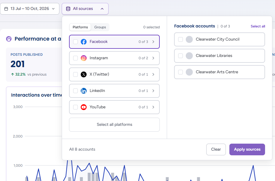
All sources covers every connected account. Click it to open the picker:
- The left column lists your Platforms, each with a tick box and an x of y count of its accounts in scope. Tick a platform to include all of its accounts; click the platform's row to list its accounts on the right, where you can tick individual ones. The heading on the right — for example Facebook accounts | 0 of 3 — carries a Select all link that becomes None once every account on that platform is ticked
- Select all platforms restores everything; it is greyed out while everything is already selected
- A Platforms / Groups switch at the top of the left column is intended to let you browse by group. In the current release the Groups view is not yet populated, so use the Platforms view and tick accounts directly; your group permissions still apply to what Insights can show yous on the right
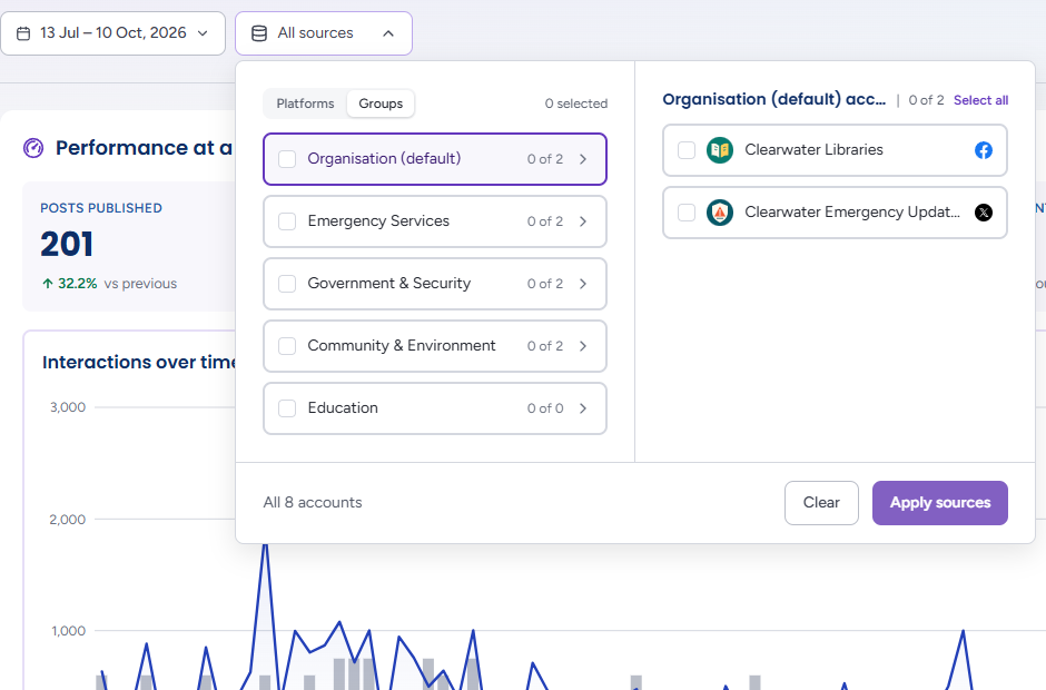
- The footer counts what is in scope — All 8 accounts, or 3 of 8 accounts once you narrow it. Clear empties the selection; Apply sources puts it into effect, and Enter does the same from anywhere in the picker. The arrow keys move up and down a column, and Right and Left arrows move between the two columns
Before any account is connected the picker says Connect your social media accounts to begin archiving content with a Go to Accounts link.
Threads is the exception: ticking it on Publishing, Engagement, Sentiment or the Posts Explorer shows a note that Threads isn't included on this page yet, so it shows only the other sources selected — or, if Threads is the only platform ticked, that there is nothing to show — rather than silently widening the scope to the whole organisation.
Export
Export opens the Export Insights report dialog, where you choose which sections to include and confirm the date range and sources the report will cover. See Exporting an Insights report.
How the Pages Load
Each page fills in panel by panel as its data arrives — the headline tiles usually appear before the charts beneath them, and panels that are still loading show grey placeholders of the same shape. If one request fails, only the panels drawn from it show an error (for example Unable to load the engagement summary) with a Retry button; the rest of the page stays usable, and so does the toolbar. A reading nobody took shows as a dash (—) rather than a measured-looking zero. Moving between pages reuses answers for a couple of minutes rather than fetching everything again.
Links Keep Your View
Each Insights page has its own address, and the date range, sources and any view switch you have changed are written into it. Copy the address from your browser and whoever opens it lands on the same page, period, accounts and view — useful for pointing a colleague at exactly what you are looking at. Links saved to the old Overview and Content pages open Performance and Publishing with the range and accounts they carried.
The Post Inspector
Post cards on Publishing, Engagement and Sentiment, every row of the Posts Explorer, and the bubbles on the Post performance and Post sentiment distribution charts open the Post Insights inspector: the post on the left, and on the right its performance, conversation, sentiment and audience figures. It is described in Posts Explorer.
Insights in the Archive
With the Insights add-on, the Archive's own record inspector gains an Insights tab. Open any record from the Archive and the tab sits alongside Comments, Media, Annotations, Details and Log:

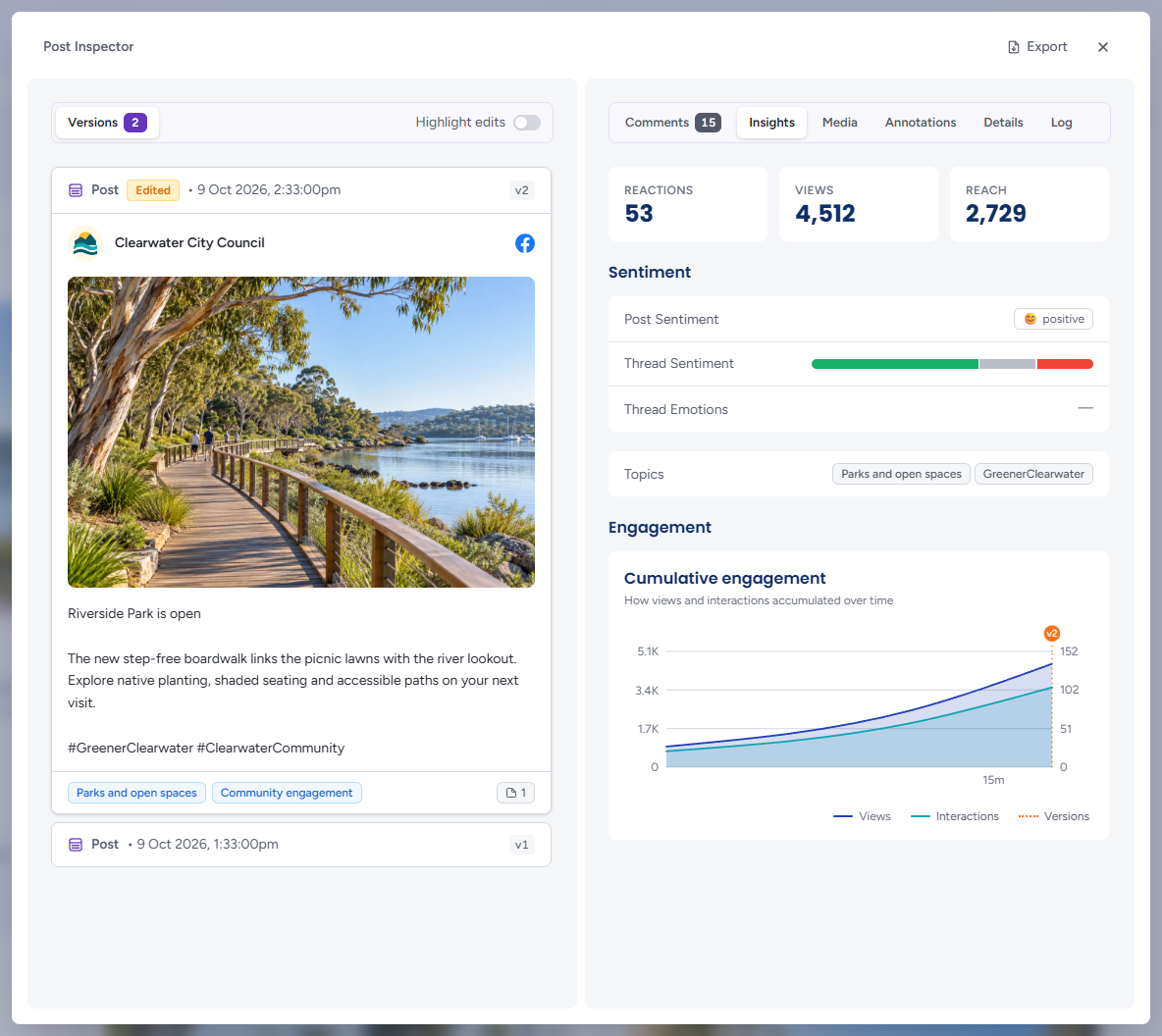
- Reactions, Views and Reach for the record
- Sentiment — the post's own sentiment as a label (Positive, Neutral, Ambiguous and so on), the thread sentiment as a bar split by the share of positive, neutral and ambiguous, mixed and negative comments (the same four bands as the Archive inspector), and the thread emotions most often expressed, each with its share
- Topics — the subjects Brolly has identified in the post, the same ones the Topics page reports on. The topic chips on each feed card come from the same analysis
- Cumulative engagement — how views and interactions accumulated over the first week, from 15 minutes to 7 days after publishing, with orange v2, v3 markers showing when each later version was captured. It answers whether an edit or an unhide changed the post's trajectory
See Viewing a Record for the rest of the Archive inspector.
How the Figures Are Defined
The pages share a vocabulary, with two points that are easy to misread:
- Reach and Views are summed across posts, so one person who saw three posts counts three times; they are not unique people
- Avg. engagement on Performance is a count — interactions divided by posts published — while Engagement rate on Engagement is a percentage of reach. Both are intended; read the unit on the tile
- Interactions are the reactions, comments and shares the platform reports, which differ by platform
- Sentiment and emotion are estimates from automated analysis of the text. They can misread sarcasm, slang or context, so treat them as a prompt to read the conversation, not a finding about the people in it
- A figure a platform does not supply is left blank or marked not available rather than counted as zero
A pattern in a chart is a reason to look, not a cause in itself: a drop in reach after a change of posting time, say, is worth investigating, not proof of why it happened.
Tips
Set the date range and sources first, then read the pages — the toolbar applies to everything below it, and the vs previous badges only make sense once the period is the one you care about.
Insights reads the Archive, so a post that was never captured (an account connected after it was published, or a platform that does not supply the metric) will not appear. If a figure looks low, check the account's connection under Settings → Accounts.
Views, saves, link clicks and commenter details depend on what each platform shares. Where a platform does not supply a metric, Insights shows a dash rather than a guess.