Sentiment
How positive or negative the response to your content is, day by day and post by post, and the emotions behind it.
Overview
Sentiment scores the comments your posts draw, from −1 (strongly negative) to +1 (strongly positive), and rolls those scores up so you can see the mood of the response over the period, which posts drew the warmest and coolest reactions, and the emotions people expressed.
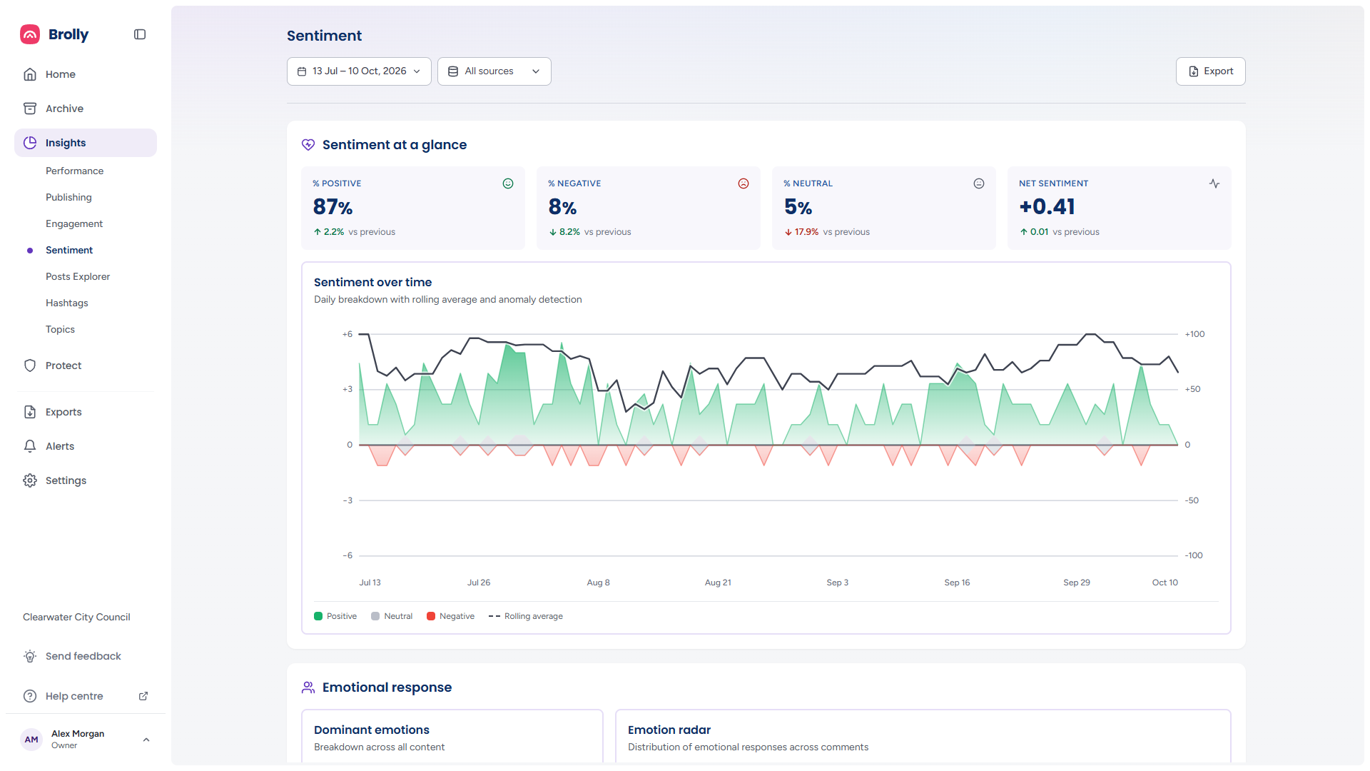
How to Get There
- Click Insights in the left sidebar, then Sentiment
Set the period and accounts with the date range and sources controls at the top, and use Export for the printable report. They are described in The Toolbar.
Sentiment at a Glance
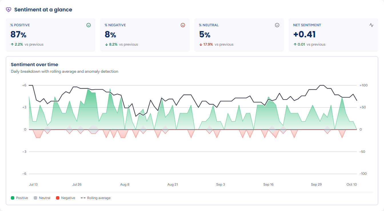
- % Positive, % Negative and % Neutral — the share of scored comments in each band. Comments scored close to zero count as neutral
- Net sentiment — the balance of positive and negative, from −1 to +1
Each carries an up or down badge against the previous period. The badge's colour follows the sense, not the direction: a rising % Negative is drawn in red even though the number went up, and a falling one in green.
Sentiment over Time
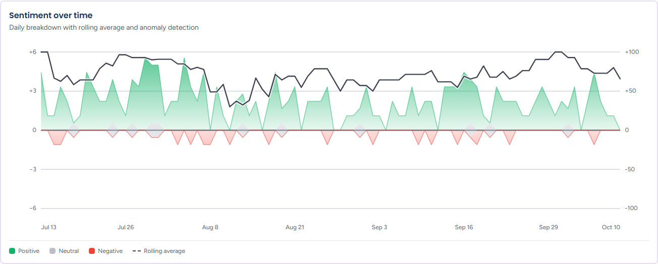
Daily breakdown with rolling average and anomaly detection. Positive comments per day are drawn above the centre line in green and negative comments below it in red, with neutral in grey, against the count scale on the left. The dark line is a rolling average of the net score, read against the right-hand axis from −100 to +100; it smooths out single noisy days and makes a genuine shift in mood easier to spot. Days that break sharply from the average are marked with a dot on the line.
Hover a day for its Positive, Neutral and Negative counts and its Net score beside the rolling average; on a marked day the tooltip adds Positive spike or Negative spike with a one-line reading of what happened. Fewer than two days of data reads Not enough sentiment data for this period.
Emotional Response
This panel is part of the emotion analysis add-on; organisations without it do not see it.
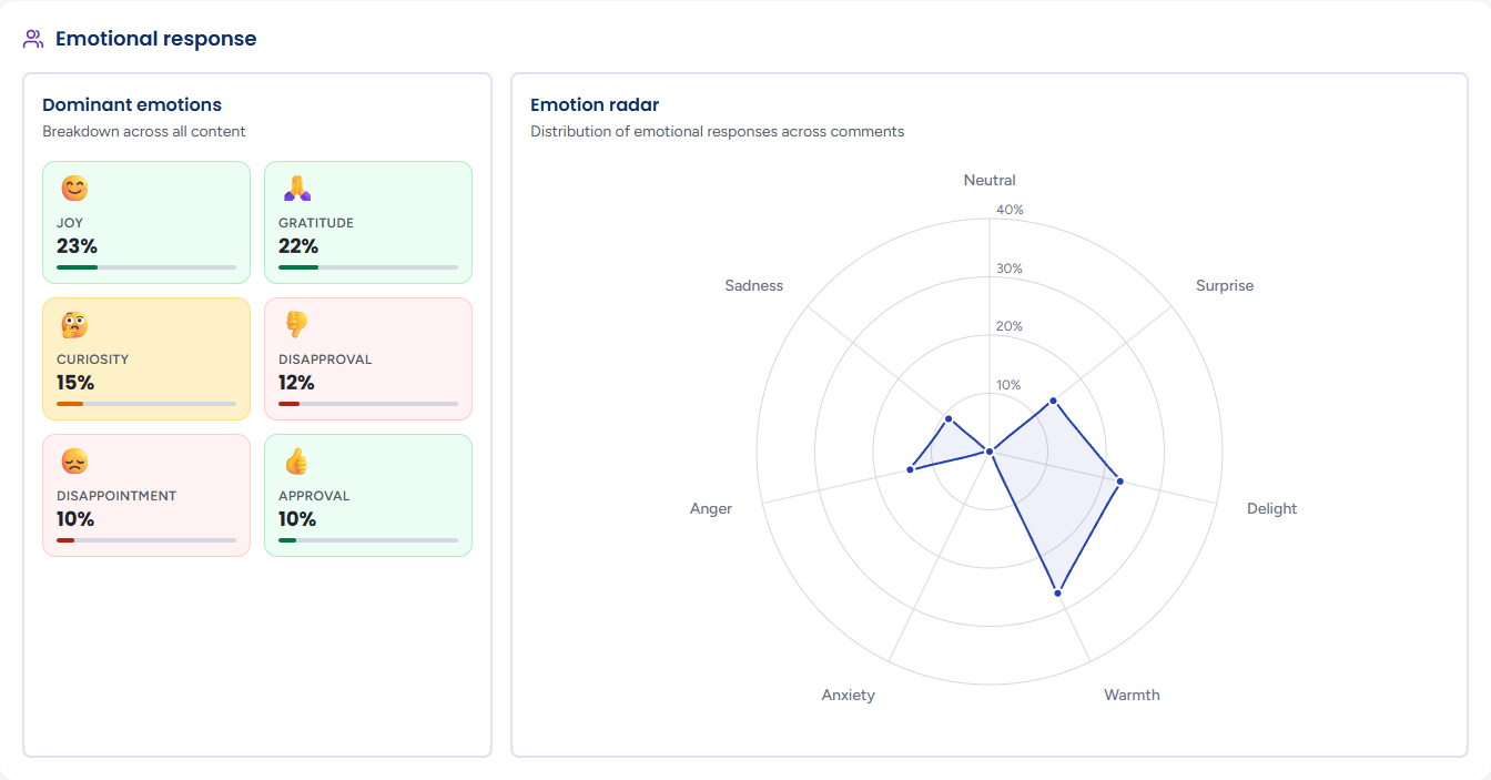
- Dominant emotions — Breakdown across all content: the six emotions most often expressed in comments, each with an icon and its share — joy, gratitude, curiosity, approval, disapproval, disappointment and so on, depending on the period
- Emotion radar — Distribution of emotional responses across comments, drawn on seven axes: neutral, surprise, delight, warmth, anxiety, anger and sadness. Hover an axis for its share. A shape that leans toward delight and warmth is a warm response; one that pulls toward anger and anxiety is not. With nothing scored it reads No emotion data for the selected range.
Top Posts by Sentiment
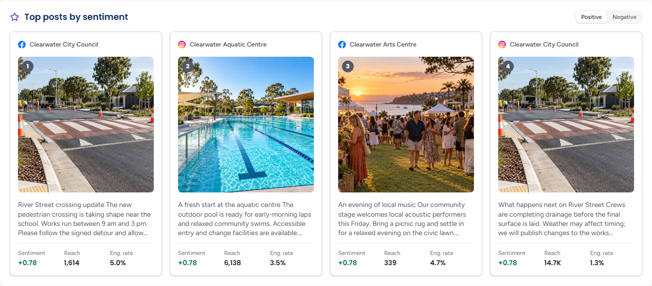
The four posts with the highest sentiment score, numbered 1 to 4, each with its account, picture, text, Sentiment, Reach and Eng. rate. Switch the toggle at the top right to Negative for the four lowest.
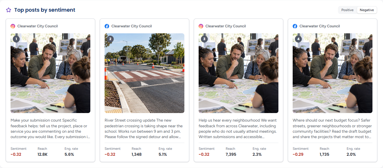
Click a card to open it in the Post Inspector, where the Sentiment tab shows the post's own score and the split of its comments. A side with nothing on it reads No negative posts in the selected range.
Post Sentiment Distribution
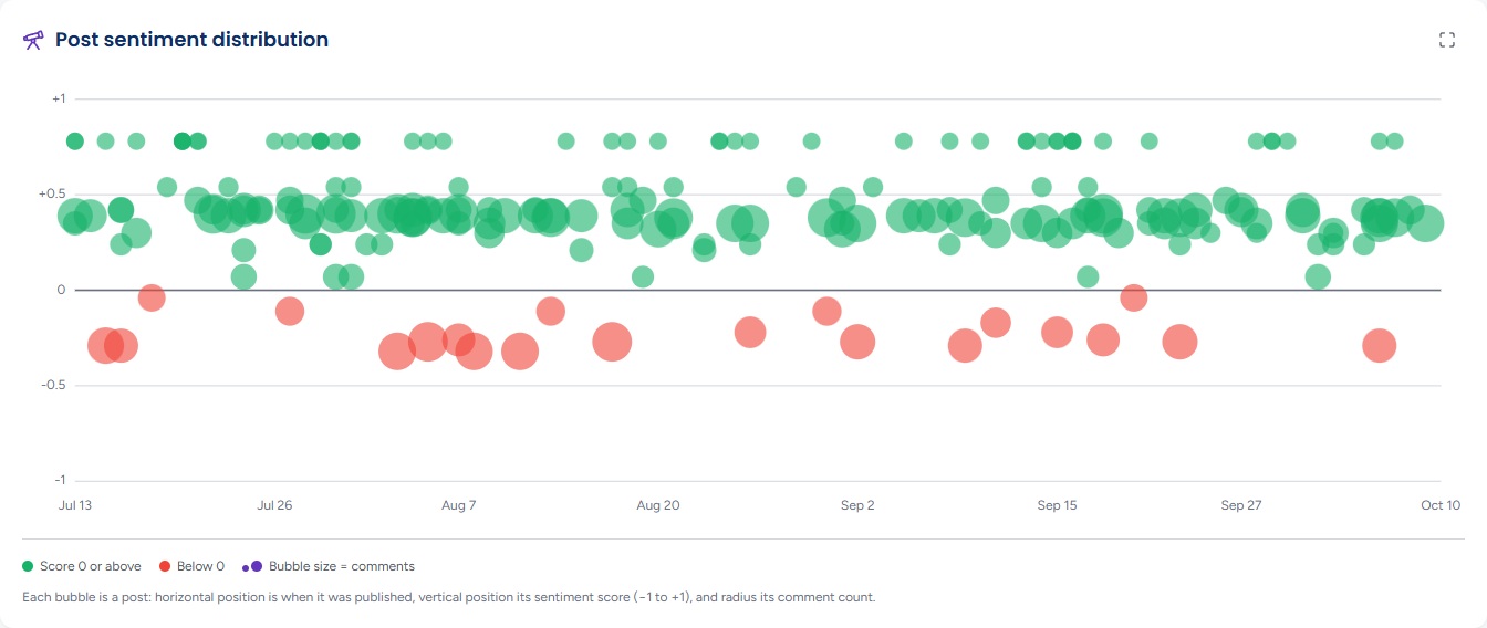
Every post in the period as a bubble: left to right is when it was published, bottom to top is its sentiment score from −1 to +1, and the bubble's size is its comment count. Posts scoring zero or above are green (Score 0 or above); those below zero are red (Below 0). The caption beneath counts the posts and how many lean each way — for example 201 posts by day and by comment sentiment, Jul 13 to Oct 10: 174 lean positive and 16 lean negative. The chart draws the date range you selected.
Hover a bubble for a preview of the post with its Sentiment, Reach and Engagement; moving across the chart highlights the day under the pointer. Click a bubble to open the post in the Post Inspector; from the keyboard, the arrow keys move between posts day by day and Enter opens one.
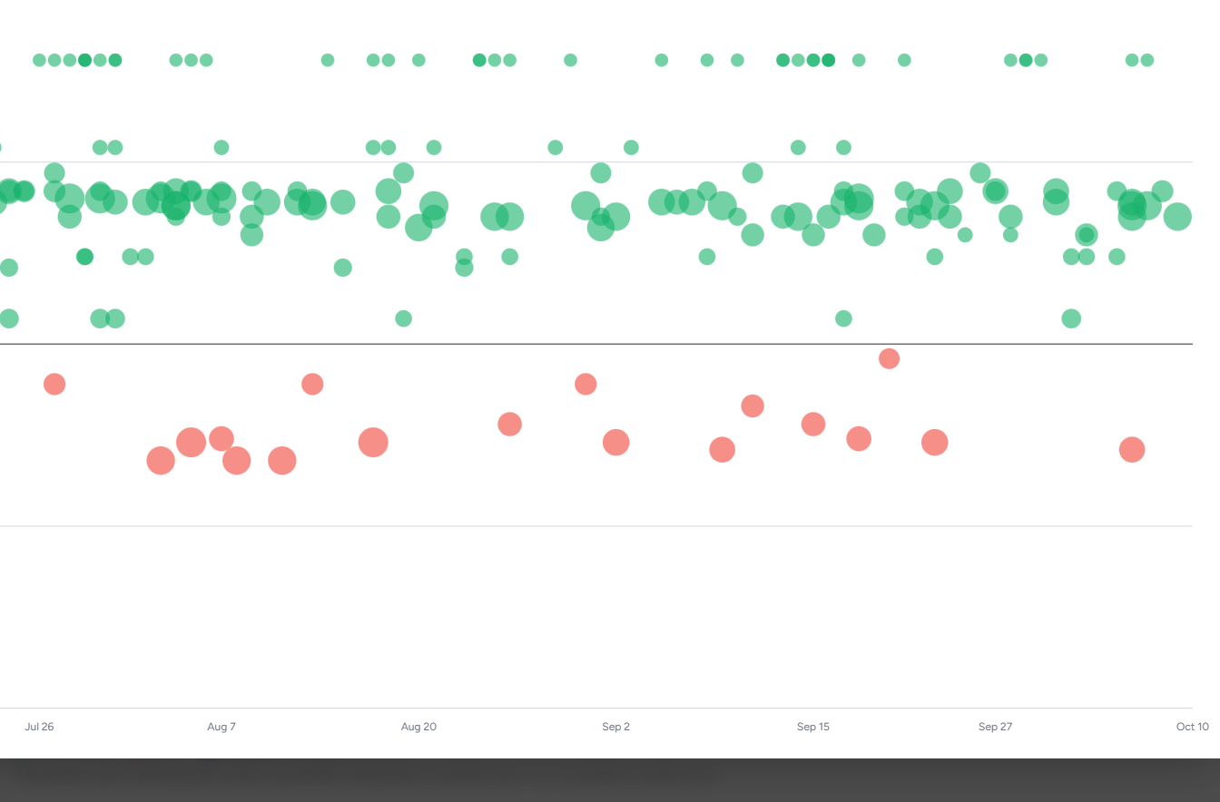
The Toggle expanded view button at the top right of the panel opens the chart full screen, with the note Press ESC or click the backdrop to close. Esc, the backdrop or the × return to the page; clicking a bubble in the expanded view closes it and opens the Post Inspector.
Tips
A large red bubble on the distribution chart is a post that drew a lot of comment and most of it negative — the one to open first.
Read Sentiment over time alongside Publishing volume: a dip in mood on a day you did not post is usually a reply to something outside your feed.
The Insights tab of the Archive's record inspector shows the same thread sentiment for any single post, so you can check one without leaving the Archive. See Insights in the Archive.