Topics
The subjects your content covers — how much attention each one draws, how it is received, whether it is a standing subject or a passing story, and which topics have the most impact — with a table of every topic and an inspector for each.
Overview
Topics groups your posts by subject — parks and open spaces, roads and transport, waste and recycling and so on — and then asks the questions that matter for each subject rather than each post: is it growing, is it landing well, does it reach beyond the people who already follow you, and which topics carry the most weight overall. The Summary view answers those with a Topic map and five charts, and the Topics Explorer lists every topic with its figures. Either view opens a Topic inspector for a single subject.
Topic Map
At the top of the Summary view, the Topic map draws the current analysis as concentric bands: the broadest themes on the inside, their narrower topics outside them, each segment sized by its share of posts and coloured by the branch it belongs to. A switch above the map chooses which level carries labels. Click a segment to focus its branch, which dims the rest of the map and lists that branch's topics beneath; click again, or the centre, to return to the whole analysis. Hovering a segment shows its post count and sentiment score. A row of the map opens the same Topic inspector as the Explorer, or drills into the theme it belongs to. The map, grouped Explorer and the inspector's Zoom tab are newer than the other charts and may be switched on per organisation; if you do not see them, the charts and Explorer below still cover every topic.
How to Get There
- Click Insights in the left sidebar, then Topics
Topics does not use the date range and sources controls the other pages share: topics come from Brolly's latest analysis of your organisation rather than a window you choose. Instead, the toolbar holds the Summary / Topics Explorer switch, a period picker and Export.
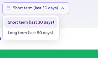
The period picker reads the horizon in effect — Short term (last 30 days) by default — and opens to switch to Long term (last 90 days). Every panel on the page reads the same horizon.

Both choices are written into the page's address, so a copied link opens the same view. Export opens the report dialog; the dialog's Topics section starts on the horizon shown here and can include the other as well. See Exporting an Insights report.
Topic Momentum
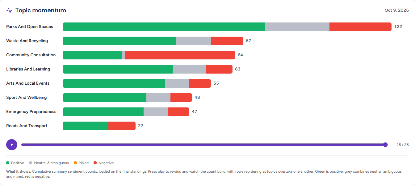
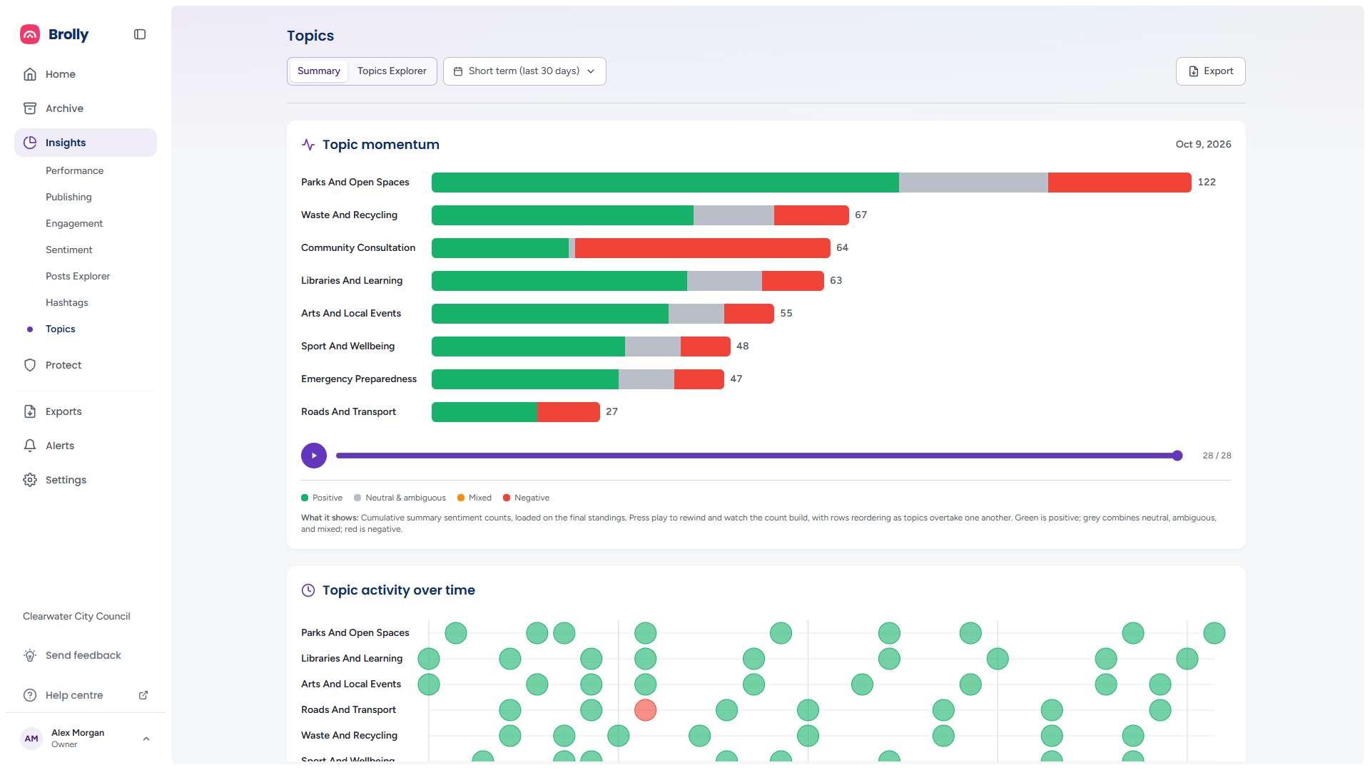
One bar per topic, longest first, showing the cumulative count of comments on that topic split by sentiment: Positive (green), Neutral & ambiguous (grey), Mixed (amber) and Negative (red), with the total at the end of the bar. The date at the top right is the day being shown. The chart loads on the final standings for the horizon.

Press Play the build-up beneath the bars to rewind to the start of the period and watch the counts build day by day, with rows reordering as topics overtake one another; the button becomes Pause while it runs and the whole run takes about thirteen seconds. Drag the Scrub timeline slider to a particular day — dragging pauses the playback. The counter at the right of the slider shows which day of the period you are on, for example 28 / 28. On a narrow window the controls are left out and the chart stays on its final standings.
Where a horizon has no day-by-day timeline to play, a plain Topics list — By post volume, one bar per topic — stands in for the momentum chart.
Topic Activity over Time
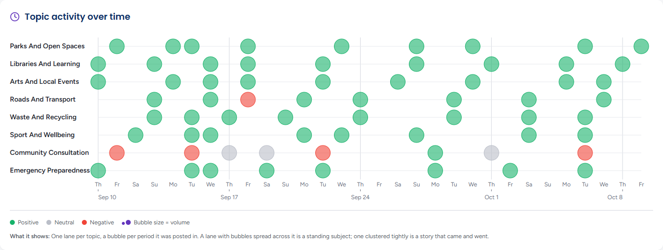
One lane per topic and a bubble for each day the topic was posted about, sized by the volume of posts and coloured Positive, Neutral or Negative by that day's sentiment. A lane with bubbles all the way across is a standing subject. One where they cluster tightly is a story that came and went. A day no scored comment covers draws a dashed Not scored ring. Hover a bubble for the topic, the day, its post count and its sentiment; the chart's text alternative lists each topic's posts, the days it was posted on and its busiest day.
Topic Performance
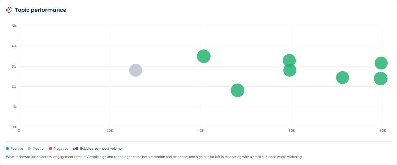
Each topic as a bubble, with reach across and engagement rate up, sized by post volume and coloured by sentiment. A topic high and to the right earns both attention and response. One high but far left is resonating with a small audience that may be worth widening. Hover a bubble for the topic's sentiment, Reach, Posts, Interactions and Engagement rate, and click it to open the Topic inspector; the arrow keys move between bubbles and Enter opens one. The caption names the topic with the widest reach and the one with the highest engagement rate.
Topic Share Comparison
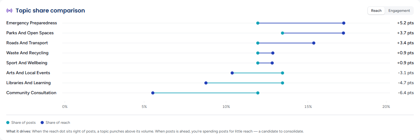
For each topic, its Share of posts against its Share of reach, drawn as two dots on one line with the difference in points beside the name (+5.2 pts, −6.4 pts). When the reach dot sits to the right of the posts dot, the topic punches above its volume. When posts are ahead, you are spending posts for little reach, which makes it a candidate to consolidate. Hover a row for its two shares.
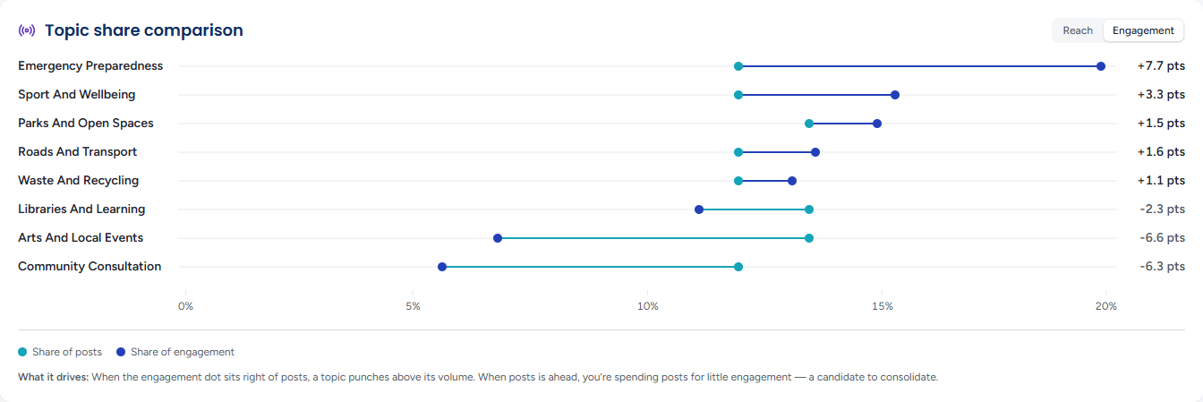
Switch the toggle at the top right from Reach to Engagement to compare share of posts with share of engagement instead; the rows slide into their new order. With no engagement recorded the panel says so and leaves the toggle in reach.
Topic Impact Index
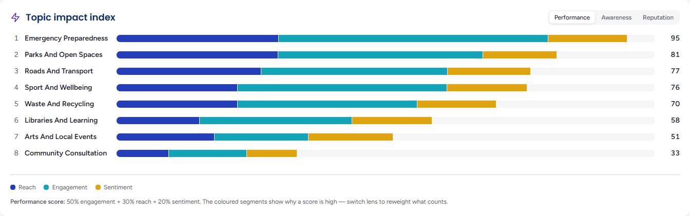
Every topic scored out of 100 and ranked, the rank beside each name. The bar's coloured segments show where the score comes from — Reach, Engagement and Sentiment — so you can see why a topic ranks where it does. The three lenses at the top right reweight the score for different questions, and the rows slide into their new order:
- Performance — 50% engagement, 30% reach, 20% sentiment: which topics work best overall
- Awareness — 25% engagement, 60% reach, 15% sentiment: which topics get seen
- Reputation — 30% engagement, 20% reach, 50% sentiment: which topics do your standing the most good
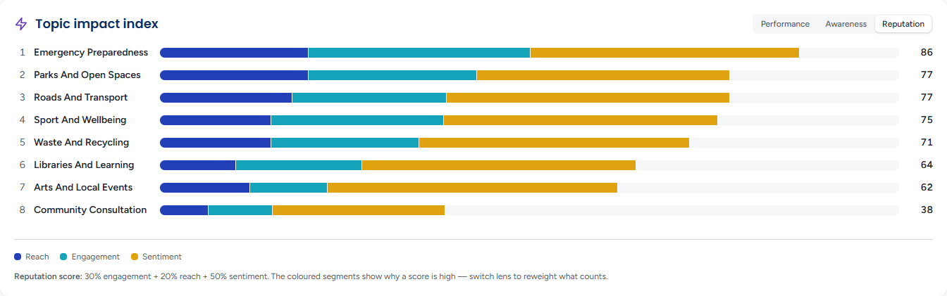
Hover a row for the figures behind its score. The note beneath the chart states the weighting of the lens you are on. Scores are relative to the topics on screen, so they cannot be compared with a hashtag's.
Each panel shows an error of its own with a Retry button if its data cannot be loaded — Unable to load topic momentum, Unable to load topic performance and so on — and the rest of the page stays.
Topics Explorer
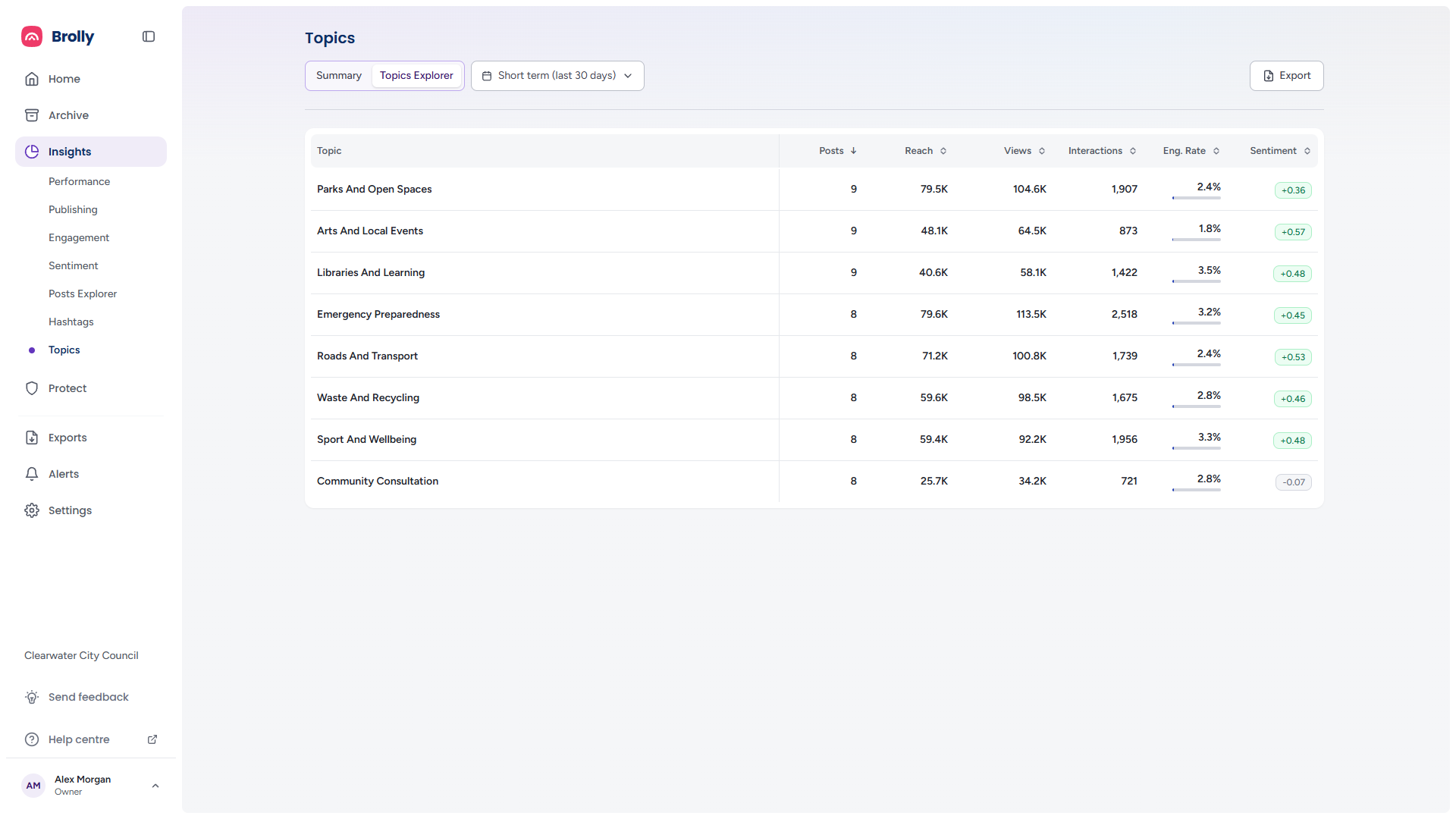
Every topic as a row with its category beneath the name, then Posts, Reach, Views, Interactions, Eng. Rate and Sentiment. Click a column heading to sort by it, and again to reverse the order; Posts descending is the default. The sentiment badge is green when positive, red when negative and grey when close to neutral. A topic no scored comment covers shows a dashed Not scored ring rather than a reading. On a narrow window the table scrolls as one with the topic column frozen, and it can be sorted from a keyboard. A horizon with no topics reads No topics detected for this selection.
Where the analysis has grouped topics, a broad topic that holds several narrower ones shows a count beside its name and a chevron in the left margin. Click the chevron to open the row onto the topics it holds, each sortable by the same headings; click it again to close. Clicking the broad topic's name opens the inspector for the group as a whole, and clicking a narrower topic opens its own.
The Topic Inspector
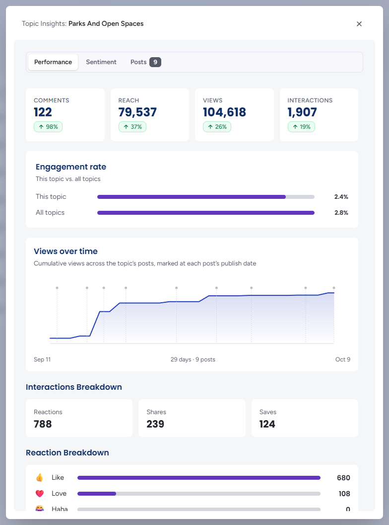
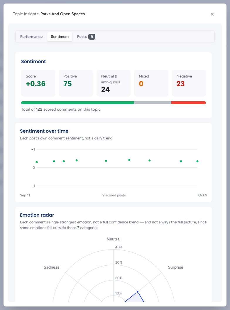
Click a topic — a row in the Explorer or a bubble on a chart — to open Topic Insights: name over the page. It has one column and three tabs. Close it with the ×, the Esc key or a click on the page behind it; changing the period picker while it is open closes it, since a topic belongs to one analysis.
- Performance — Comments, Reach, Views and Interactions, each badged against the average across the other topics in view, so a topic's reach reads as high or low for your organisation rather than as a bare number. Engagement rate is drawn as This topic against All topics. Views over time charts cumulative views across the topic's posts, marked at each post's publish date, and the Interactions Breakdown gives Reactions, Shares and Saves, with a Reaction Breakdown where a platform reports one
- Sentiment — the Score and the Positive, Neutral & ambiguous, Mixed and Negative counts over a stacked bar; Sentiment over time, which plots each post's own comment sentiment rather than a daily trend; and, with the emotion add-on, the Emotion radar, withheld until enough comments have been emotion-scored
- Posts — every post on the topic, newest first, the tab's badge counting them: each with its picture, date, platform icon and publishing account, text, Comments and Comment sentiment. The eye on a row (Open in Post Insights) opens the full Post Inspector in front of the topic, so you can read a post without losing your place; Esc closes the post first, then the topic
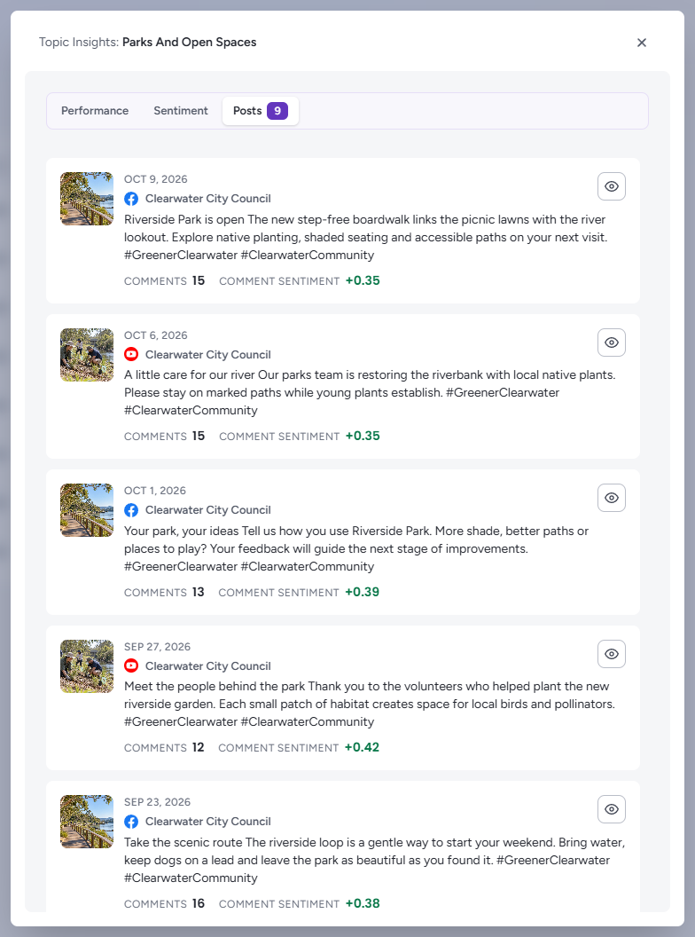
Where the Inspector lists only part of the topic's posts, a note under the charts says how many it covers; posts on a platform Insights cannot show yet are counted in a second note rather than silently dropped. A topic with nothing listed reads No posts found for this topic.
Zooming In and Out of a Topic
The inspector's Zoom tab places the topic in its analysis: the narrower cuts it contains and the broader theme it belongs to, each with its post count, so you can move between levels without going back to the map. Opening one of them switches the inspector to that topic.
Tips
A topic that ranks high on Awareness but low on Reputation is being seen widely and received coolly — read its negative comments on the Sentiment page before posting more of it.
Play the Topic momentum build-up when a subject has suddenly climbed the ranking. The day it overtook the others is usually the day something happened.
Use Topic share comparison to plan the next month's content: topics whose reach share outruns their posts share can take more posts, and topics well behind can take fewer.